How to make a research poster: a step-by-step guide for beginners
A research poster is a one-page visual summary of a study that people read standing up, often from a few metres away, while you stand beside it. Making a good one is less about design talent than about cutting: one clear message, short labelled text, and figures big enough to read across a corridor.
This guide shows how to make a research poster (or scientific poster) from a blank page to a printed sheet in 13 steps. Every step has concrete numbers (word counts, font sizes, distances), annotated real posters and editor screenshots, and do/don't comparisons. It works whether you use PosterScientist, PowerPoint or another tool.
Open the poster editor · Research poster templates · Research poster examples
Quick answer: how to make a research poster
- Write the one finding you want people to remember.
- Check the conference rules: size, orientation, deadline.
- Pick a template and set the exact poster size.
- Lay out 2–4 columns that read top-to-bottom, left-to-right.
- Write 300–800 words in short labelled sections.
- Make 2–4 large figures, each with a takeaway title.
- Use body text of 24–32 pt, headings 36–54 pt, title 85+ pt.
- Add references, logos and a QR code to the paper.
- Test-print one section at 100%, then export a PDF and print.
- Prepare a 30-second and a 2-minute explanation.
What to include in a research poster
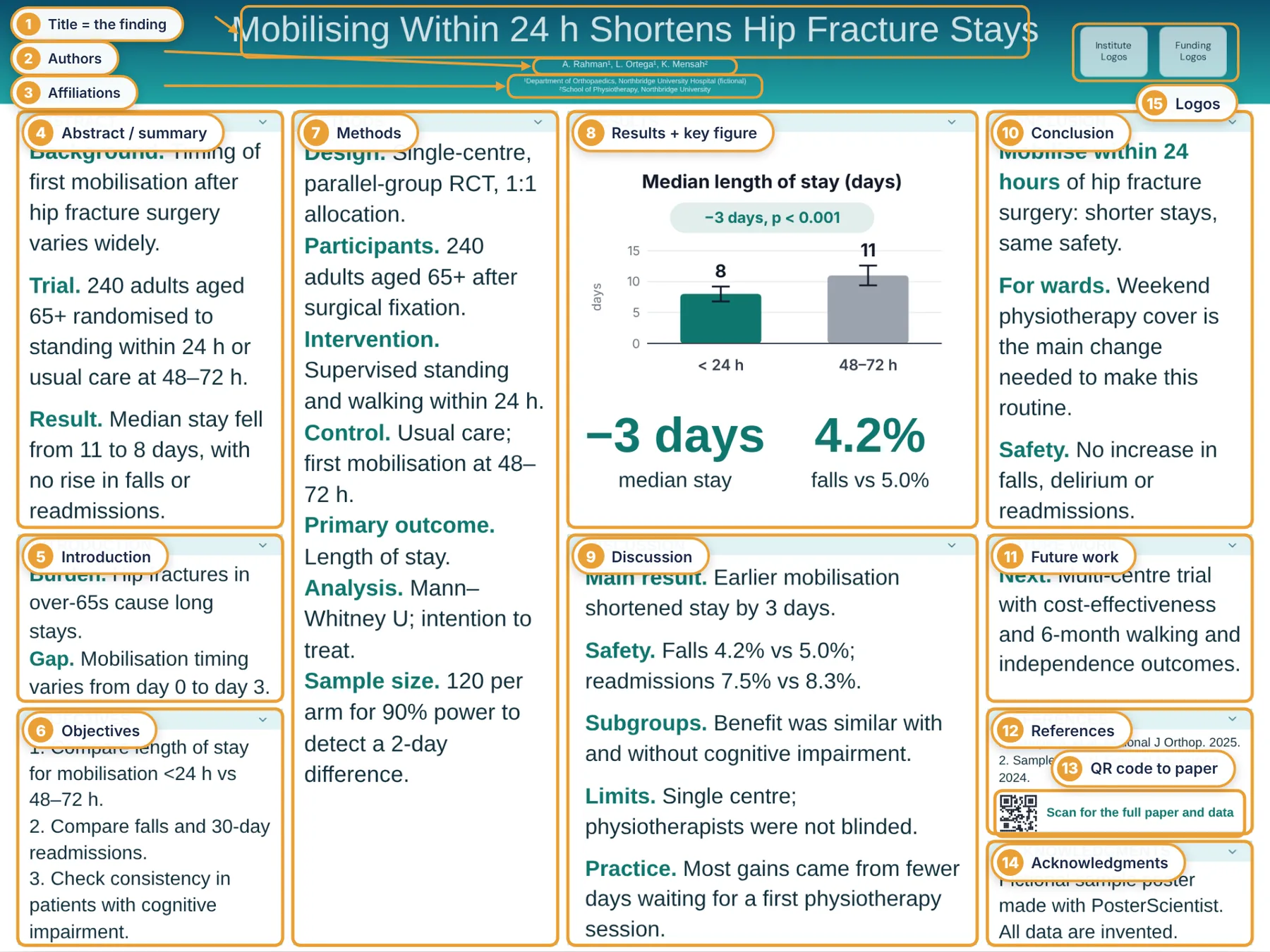
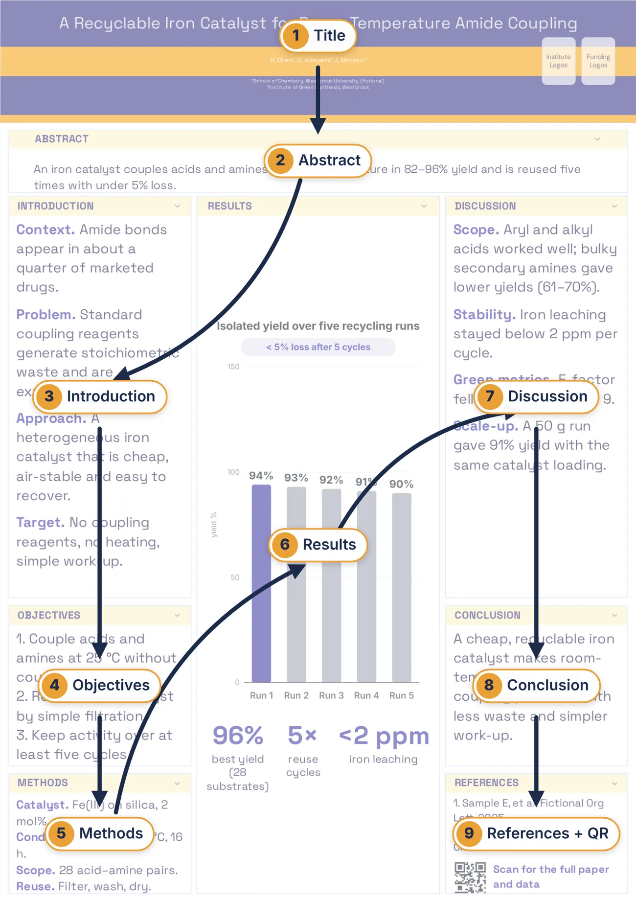
Most research posters follow the structure of a short paper, cut to the minimum a visitor needs. The annotated poster below labels every part of a typical conference poster; the table after it gives a word budget for each section.
| Section | What it does | Suggested length |
|---|---|---|
| Title | States the finding or question in plain words | Under 15 words |
| Authors & affiliations | Who did it and where; mark the presenting author | 1–3 lines |
| Abstract / summary (if required) | The whole study in miniature | 50–150 words |
| Introduction | Why it matters and the gap you address | 50–100 words |
| Objectives / hypothesis | What you set out to test | 1–3 short points |
| Methods | Design, sample, key measures; a diagram beats prose | 75–150 words or a flow chart |
| Results | 2–4 figures, each with a one-line takeaway | 100–200 words incl. captions |
| Discussion / conclusions | What it means, limits, next steps | 3 points, 50–100 words |
| References & acknowledgments | Key sources, funding, collaborators | 3–5 short references |
| QR code | Links to the paper, preprint, data or your profile | One code, 3–5 cm wide |
Tip: Check the call for posters first: some meetings require an abstract section, specific logos or a disclosure statement, and case reports use Case presentation / Discussion instead of Methods / Results.
How long it takes: a two-week time plan
Design is the quick part. Most of the time goes into deciding what to leave out and making figures. Work backwards from the printer's deadline, not the conference date.
| When | Task | Time |
|---|---|---|
| Day 1 | Read the poster rules; write the one-sentence message and title | 1 hour |
| Days 2–3 | Draft text for each section in a document; sketch the layout on paper | 3–4 hours |
| Days 4–6 | Make or redraw 2–4 figures at poster size | 4–8 hours |
| Day 7 | Choose a template, set the size, place text and figures | 1–2 hours |
| Days 8–9 | Feedback from your supervisor and a non-expert; cut 20% | 1–2 hours |
| Day 10 | Test-print one section at 100%; proofread; export PDF | 1 hour |
| Days 10–14 | Printing and delivery (online printers often need 3–5 working days) | — |
| Day before | Rehearse your 30-second and 2-minute explanations | 30 minutes |
Step 1: Plan your message before you design
People give a poster a few seconds while walking past. Decide what they should take away before you open any software. Answer three questions in writing:
- What is the one finding? Write it as a single sentence a colleague from another field would understand.
- Who will walk past? Specialists at a niche meeting can take jargon; a general session or student symposium cannot.
- What do you want them to do? Ask a question, read the paper, collaborate, hire you? Plan a QR code or handout for it.
Turn the one-sentence finding into your title. A title that states the result gets more readers than one that names the topic.
Do
- Mobilising within 24 h shortens hip-fracture hospital stays
- A recyclable iron catalyst couples amides at room temperature
Don't
- A randomised controlled trial investigating the effects of early versus delayed postoperative mobilisation on length of stay…
- Investigation of novel heterogeneous catalysis approaches
Step 2: Check the conference rules and poster size
Find the poster instructions on the conference website (often under "Presenter information" or "Poster guidelines") and write down:
- Size and orientation, for example A0 portrait or 48 × 36 in landscape. The board size is the maximum; leave a little margin.
- Required content: abstract number, logos, disclosures, a set section order.
- Mounting: push pins, Velcro or tape, or a screen for e-posters (then you need a PDF or image at a set pixel size).
- Deadlines: PDF upload for the online programme, and when you must hang and remove the poster.
| Size | Dimensions | Where you see it |
|---|---|---|
| A0 portrait | 84.1 × 118.9 cm (33.1 × 46.8 in) | Most European and Asian conferences |
| 48 × 36 in landscape | 121.9 × 91.4 cm | Very common at US meetings |
| 36 × 48 in portrait | 91.4 × 121.9 cm | US meetings with portrait boards |
| A1 portrait | 59.4 × 84.1 cm | Student symposia, departmental events |
| 42 × 42 in or 48 × 48 in | Square | Some medical and engineering meetings |
If the instructions only give a board size, design at the board size minus about 5 cm on each side. More detail is in the research poster size guide.
Step 3: Choose a research poster template
A template saves hours of alignment work and gives you a tested type scale. Choose by content, not looks:
- Text-heavy or qualitative work: 2 columns, portrait.
- Figure-heavy results: 3 columns portrait or 4 columns landscape, with a wide centre column for the key figure.
- One striking result: a better poster template with the main finding in the centre.
- Clinical cases: a case report template with case-specific sections.
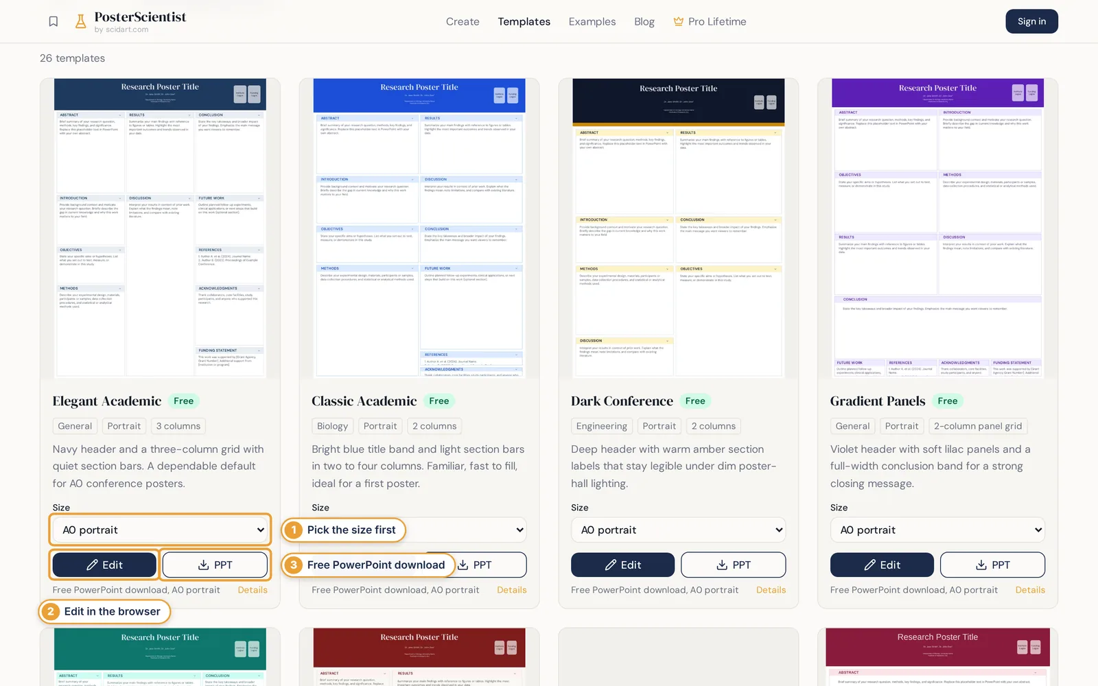
Browse 26 research poster templates, filter by field, orientation and size. See all templates
Step 4: Set the exact poster size before adding content
Never design on a normal slide and enlarge it later: fonts, line widths and image resolution all scale with it and usually end up wrong. Set the real size first.
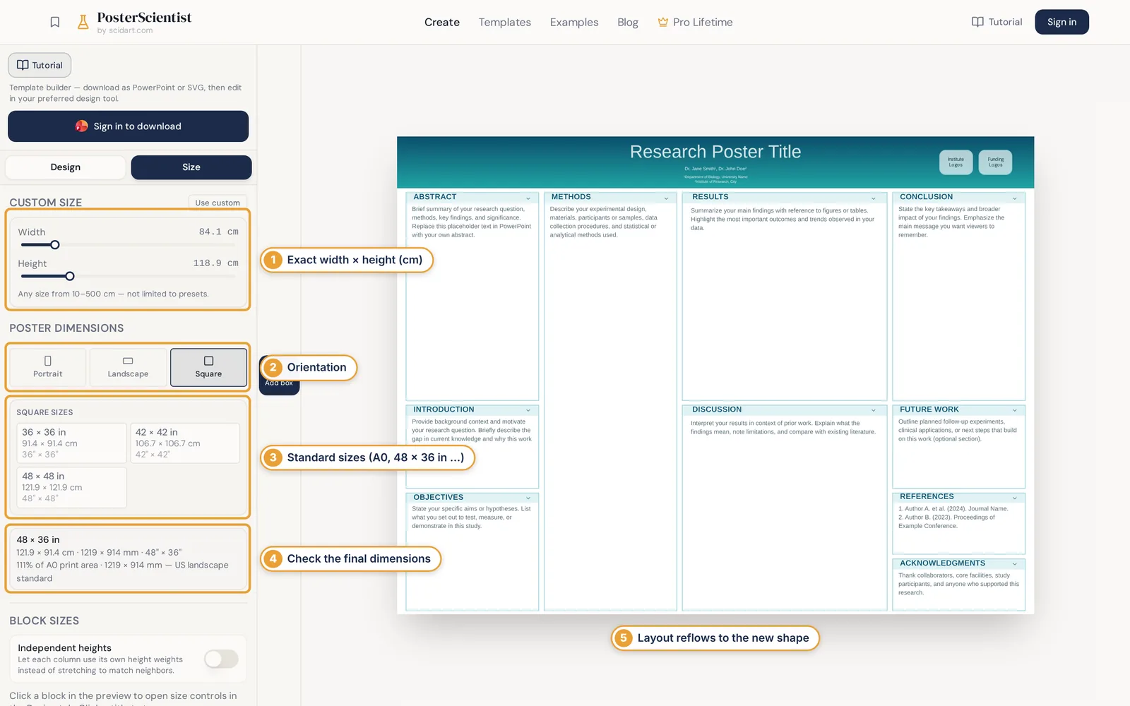
In PowerPoint, the equivalent is Design → Slide Size → Custom Slide Size. PowerPoint's maximum slide size is 56 in (142.24 cm), so for anything larger design at half scale (for example 36 × 24 in for a 72 × 48 in poster) and ask the printer to print at 200%.
Step 5: Plan the research poster layout and reading order
Readers scan a poster in columns: down the first, back to the top of the next. Keep that flow obvious. Avoid layouts where the eye has to zig-zag across the full width.
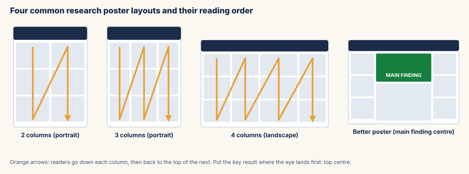
- Give the results the widest column or the top-centre position.
- Align box edges to a grid; equal gutters (about 2–3 cm on A0) look tidy.
- Leave white space: about 30–40% of the area free of text is normal for a readable poster.
- Sketch the layout on paper first. It is faster to move rectangles than paragraphs.
More layout patterns, with examples, are in the research poster layout guide.
Step 6: Write concise text (with word counts)
Draft in a document, then paste. A typical poster carries 300–800 words in total, far less than the abstract plus methods of the paper. Use the word budget in the table above and these rules:
- Lead each point with a bold label (Design., Sample., Result.) so people can scan.
- Keep sentences under about 20 words and paragraphs to 2–3 lines.
- Replace methods prose with a flow chart or numbered steps.
- Write conclusions as 2–3 statements, not "further research is needed".
- Spell out abbreviations once, or avoid them.
Do
- Design. Randomised trial, 240 adults aged 65+.
- Result. Median stay fell from 11 to 8 days.
- So what? Weekend physiotherapy cover is the main change needed.
Don't
- In this study we sought to investigate whether the timing of postoperative mobilisation, which has been proposed as a modifiable factor, might influence…
- Results are shown in Figure 3 (see text for details).
Step 7: Make figures and charts that read from 2 metres
Figures are what pull people in. Redraw them for the poster rather than pasting paper figures: fewer panels, thicker lines, bigger labels.
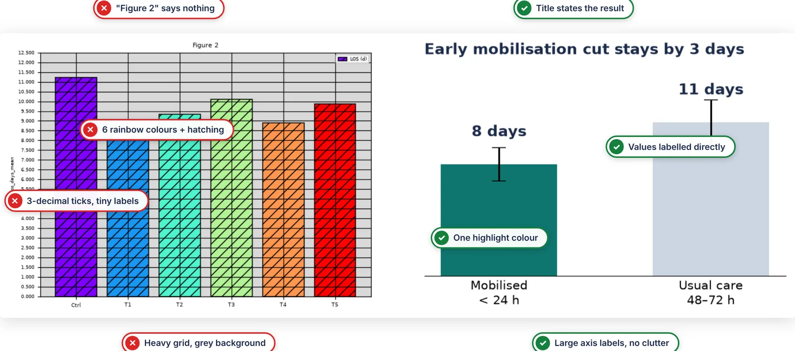
- Title = takeaway: "Early mobilisation cut stays by 3 days", not "Figure 2".
- Label directly on bars or lines instead of using a legend.
- One highlight colour for the thing that matters; grey for comparisons.
- Axis text at least 18–24 pt at the printed size.
- Resolution: export charts as vector (SVG or PDF), and photos at 150–300 dpi at the final printed size.
- Show uncertainty (error bars, intervals) and say what it is in the caption.
More chart advice: data visualisation for research posters.
Step 8: Set colours, fonts and font sizes for reading distance
A poster works at three distances. The title must make sense from about 5 m, headings and figures from about 2 m, and body text when someone stops at about 1 m.
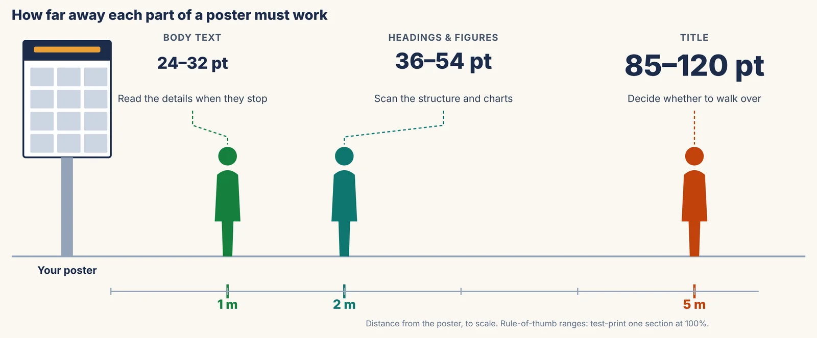
| Element | Size | Readable from |
|---|---|---|
| Title | 85–120 pt | About 5 m |
| Section headings | 36–54 pt | About 2–3 m |
| Body text | 24–32 pt | About 1–2 m |
| Captions, references | 18–24 pt (never below 18) | About 1 m |
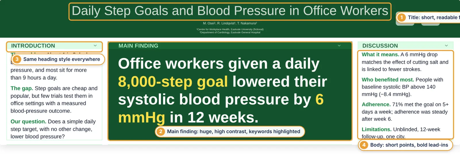
- Use one or two font families; a clean sans serif (Arial, Helvetica, Inter, Lato) reads best at a distance.
- Avoid ALL CAPS for anything longer than a heading, and avoid justified text (uneven gaps).
- Keep to one accent colour plus neutrals; use it for the key result.
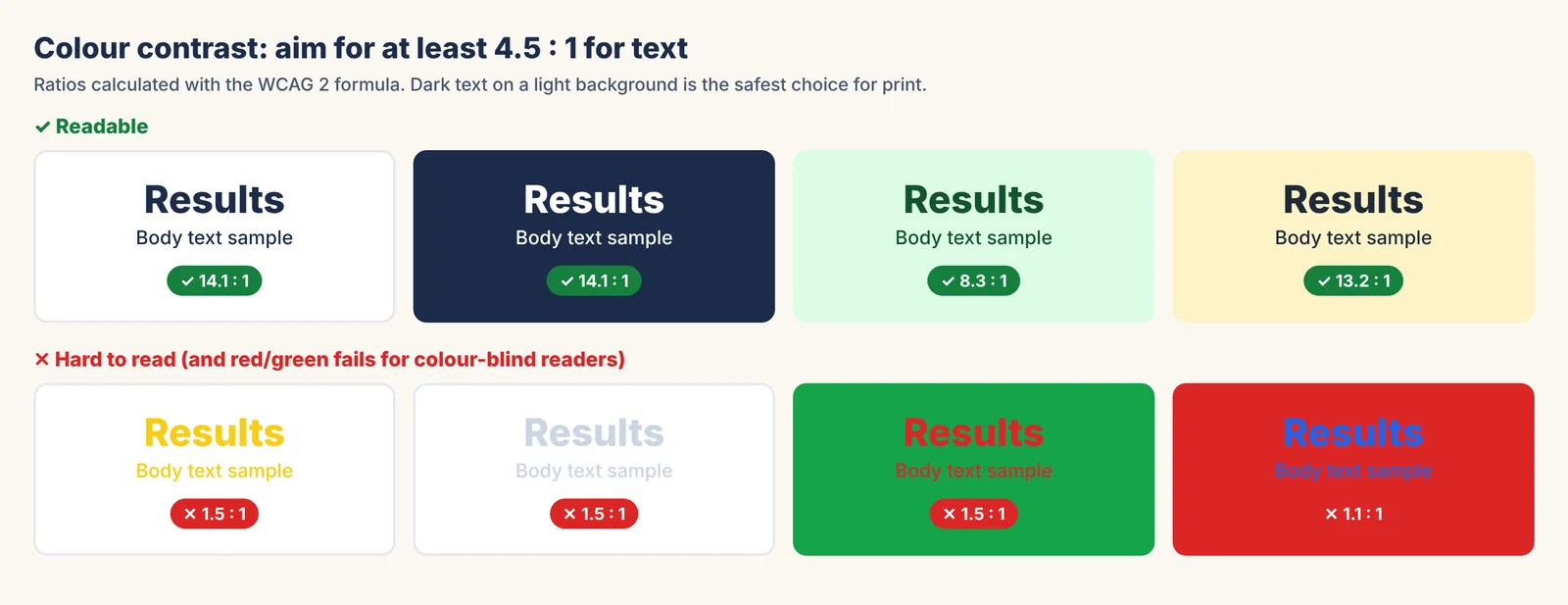
- Aim for a text contrast ratio of at least 4.5 : 1 (the WCAG AA level for normal text). Dark text on a light background is safest in print.
- Do not rely on red versus green alone; about 1 in 12 men has red–green colour vision deficiency. Add labels or use a colour-blind-safe palette.
Deeper dive: typography guide for academic posters.
Step 9: Add references, acknowledgments, logos and a QR code
- References: 3–5 key sources in a short numbered format at 18–24 pt. Full lists can live behind the QR code.
- Acknowledgments and funding: one or two lines; many funders require their grant number.
- Logos: follow your institution's brand rules and use a transparent PNG or SVG.
- QR code: link to the paper, preprint, data, a PDF of the poster or your profile. Make it 3–5 cm wide, add a short label ("Scan for the full paper"), and test it from a printout at 1 m with two phones.
- Use a stable link (DOI, OSF, institutional repository) rather than a link that may expire.
Step 10: Build the poster in the editor
With text and figures ready, building the poster takes about an hour. In PosterScientist the main controls are all on the left panel:
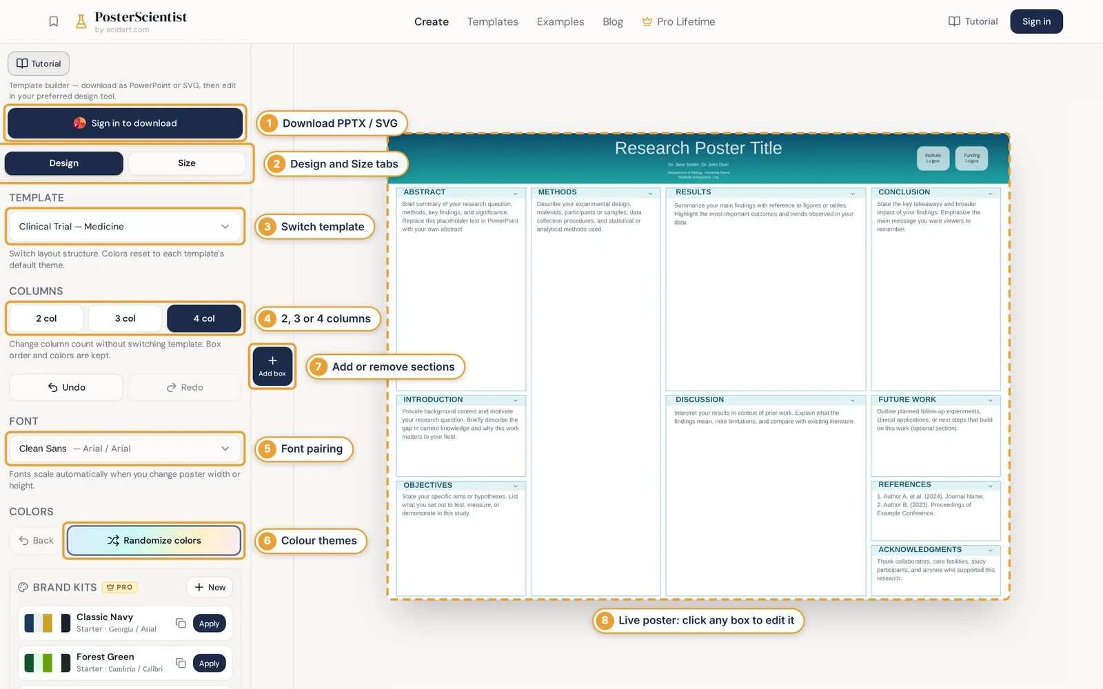
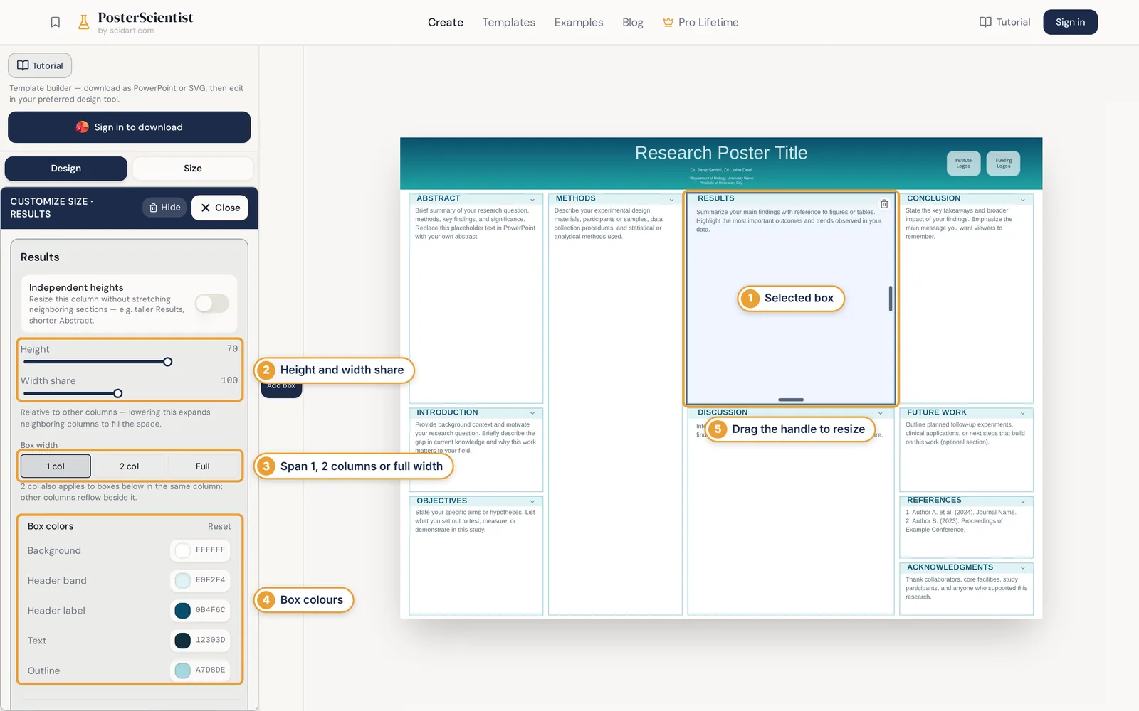
- Open your template at the right size.
- Use Add box to switch sections on or off (for example Abstract or Future work).
- Pick a colour theme and font pairing, or apply a brand kit with your institution's colours and logos (Pro).
- Resize boxes so the results get the most room; keep column bottoms roughly level.
- Download the editable PowerPoint (.pptx) or SVG and paste in your final text and figures.
Free to start, no install. Open a template at your poster size. Open the poster editor
Step 11: Review the poster with a checklist
Print the checklist below, or use it on screen. Ask one person in your field and one outside it to read the poster for 30 seconds and tell you the main finding. If they cannot, simplify.
Message
- ☐ The title states the finding in under 15 words
- ☐ A stranger can say the main finding after 30 seconds
- ☐ Conclusions are 2–3 concrete statements
Text
- ☐ Total text is 300–800 words
- ☐ No paragraph is longer than 3 lines
- ☐ Abbreviations are defined or removed
- ☐ Spelling, names and affiliations are checked
Figures
- ☐ Each figure has a takeaway title
- ☐ Axis labels are at least 18–24 pt at print size
- ☐ Images are vector or at least 150–300 dpi at print size
- ☐ Colours are distinguishable without red/green alone
Layout & readability
- ☐ Size and orientation match the instructions
- ☐ Reading order is obvious (columns, top to bottom)
- ☐ Body text 24–32 pt, title 85 pt or more
- ☐ Text contrast is at least 4.5 : 1
Details
- ☐ Logos, funding and disclosures are present
- ☐ The QR code scans from 1 m on two phones
- ☐ One section test-printed at 100% and read from 2 m
Step 12: Export and print your poster
- Export a PDF at the real size (in PowerPoint: File → Export → Create PDF, or Save As → PDF, with quality set to high). Open it and zoom to 100% to check images.
- Embed fonts or use common fonts so nothing changes on the printer's computer.
- Test-print one section on A4 or letter paper at 100% scale and read it from 1–2 m.
- Paper or fabric: matte paper avoids glare under hall lights; fabric posters fold into luggage and do not crease.
- Lead time: university print shops and online printers often need 2–5 working days. Order early and carry the poster in a tube.
The complete guide to printing a research poster covers paper types, costs and file checks.
Step 13: Present your poster at the conference
- Prepare two versions of your explanation: a 30-second version (question, finding, why it matters) and a 2-minute walk through the figures.
- Stand to the side, not in front of the poster, and greet people who slow down: "Can I give you a quick overview?"
- Point to figures while you talk; the poster is your slide deck.
- Ask questions back ("What's your work on?"): poster sessions are for conversations and networking.
- Bring extras: business cards, a few A4 handouts or the QR code, pins or Velcro, and a pen to note feedback.
More poster presentation tips: the poster presentation guide and networking at poster sessions.
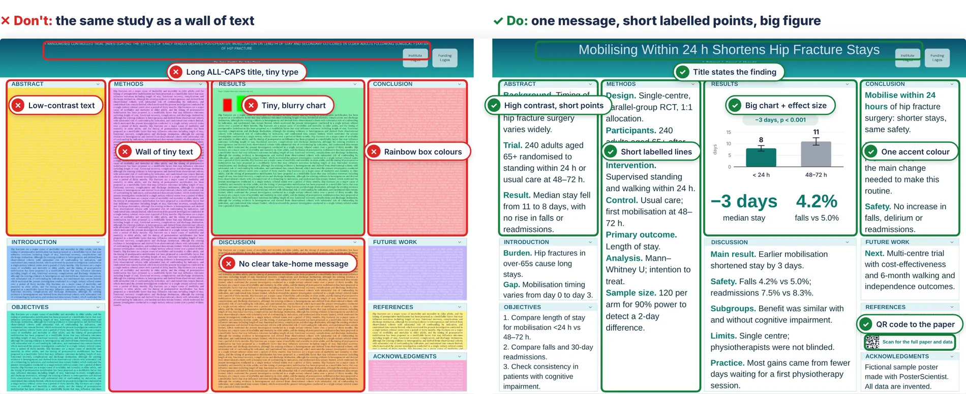
Research poster design: a good vs bad example
Here is the same fictional study designed two ways. Both use the same template and size. The only differences are the decisions from steps 1–8.
Common research poster mistakes (and quick fixes)
| Mistake | Quick fix |
|---|---|
| Designing on a normal slide and scaling it up | Set the real size first (step 4) |
| Pasting the abstract and full methods | Cut to 300–800 words; use a methods diagram |
| Title that names the topic, not the finding | Rewrite the title as the result |
| Body text below 24 pt | Cut words rather than shrinking type |
| Low-resolution or pasted paper figures | Redraw; export as vector or 300 dpi at print size |
| Too many colours and fonts | One accent colour, one or two fonts |
| Red/green-only charts | Use a colour-blind-safe palette plus labels |
| No clear reading order | Columns read top to bottom, left to right |
| Untested QR code | Test from a printout at 1 m |
| Ordering the print the day before | Allow 2–5 working days |
How to make a research poster in PowerPoint
PowerPoint is the most common tool for scientific posters because almost everyone has it. The quickest route is to start from a ready-made file:
- Download a free PowerPoint poster template at your size from the templates page (no sign-in for free templates), or build one in the editor and download it as .pptx.
- If starting from blank: Design → Slide Size → Custom Slide Size, enter the width and height (maximum 56 in; for larger posters use half scale).
- Turn on View → Guides and keep equal margins and gutters.
- Insert figures with Insert → Pictures (or paste charts as vector EMF/SVG) and never stretch them out of proportion.
- Export with File → Export → Create PDF/XPS and check the PDF at 100% zoom before sending it to print.
See the PowerPoint poster template page for sizes and previews.
Research poster FAQ
How do you make a research poster step by step?
Plan one key message, check the conference size and rules, choose a template, set the exact size, lay out 2–4 columns, write 300–800 words in short sections, add 2–4 large figures, set readable fonts and colours, add references and a QR code, review with a checklist, export a PDF and print, then prepare a short explanation.
What should be included in a research poster?
Typically a title, authors and affiliations, introduction, objectives, methods, results with figures, conclusions, references, acknowledgments and logos. Many conferences also ask for an abstract, and a QR code to the paper or data is now common.
How many words should a research poster have?
Most guides recommend about 300–800 words in total. Less text with larger figures is usually more effective than a full summary of the paper.
What font size should a scientific poster use?
For A0 or 48 × 36 in posters, a common rule of thumb is 85–120 pt for the title, 36–54 pt for headings, 24–32 pt for body text and at least 18 pt for captions and references.
What is the standard research poster size?
There is no single standard. A0 portrait (84.1 × 118.9 cm) is most common in Europe and Asia, and 48 × 36 in landscape or 36 × 48 in portrait are common in North America. Always use the size in your conference instructions.
How do I make a research poster in PowerPoint?
Set the slide to your poster size under Design → Slide Size → Custom Slide Size (maximum 56 in), or start from a ready-made PowerPoint template, add your text and figures, then export a PDF for printing.
How long does it take to make a research poster?
Plan for about two weeks: a few days for writing and figures, an hour or two for layout with a template, a round of feedback, and 2–5 working days for printing.
How do I design a scientific poster that stands out?
Make the title state the finding, give the key figure the most space, use one accent colour, keep plenty of white space and cut text. Layouts such as the better poster put the main finding in large type at the centre.
What are good poster presentation tips?
Prepare a 30-second and a 2-minute explanation, stand beside rather than in front of the poster, invite people in with a short question, point to figures as you talk, and bring a QR code, handouts or business cards.