Better poster templates: put the main finding first
The "better poster" (or #betterposter) style puts one plain-language main finding in huge type at the centre of the poster, so people walking past understand the result in seconds. The approach was popularised in 2019 by Mike Morrison, then a PhD student, in a widely shared video. PosterScientist is not affiliated with him; the templates below are our own designs in the same spirit.
Start with Billboard (free), or use Atelier or Orbit (Pro) if you want the key finding framed in a circle while keeping a more traditional structure around it.
Open the free Billboard template · See a finished example
A finished better-poster example
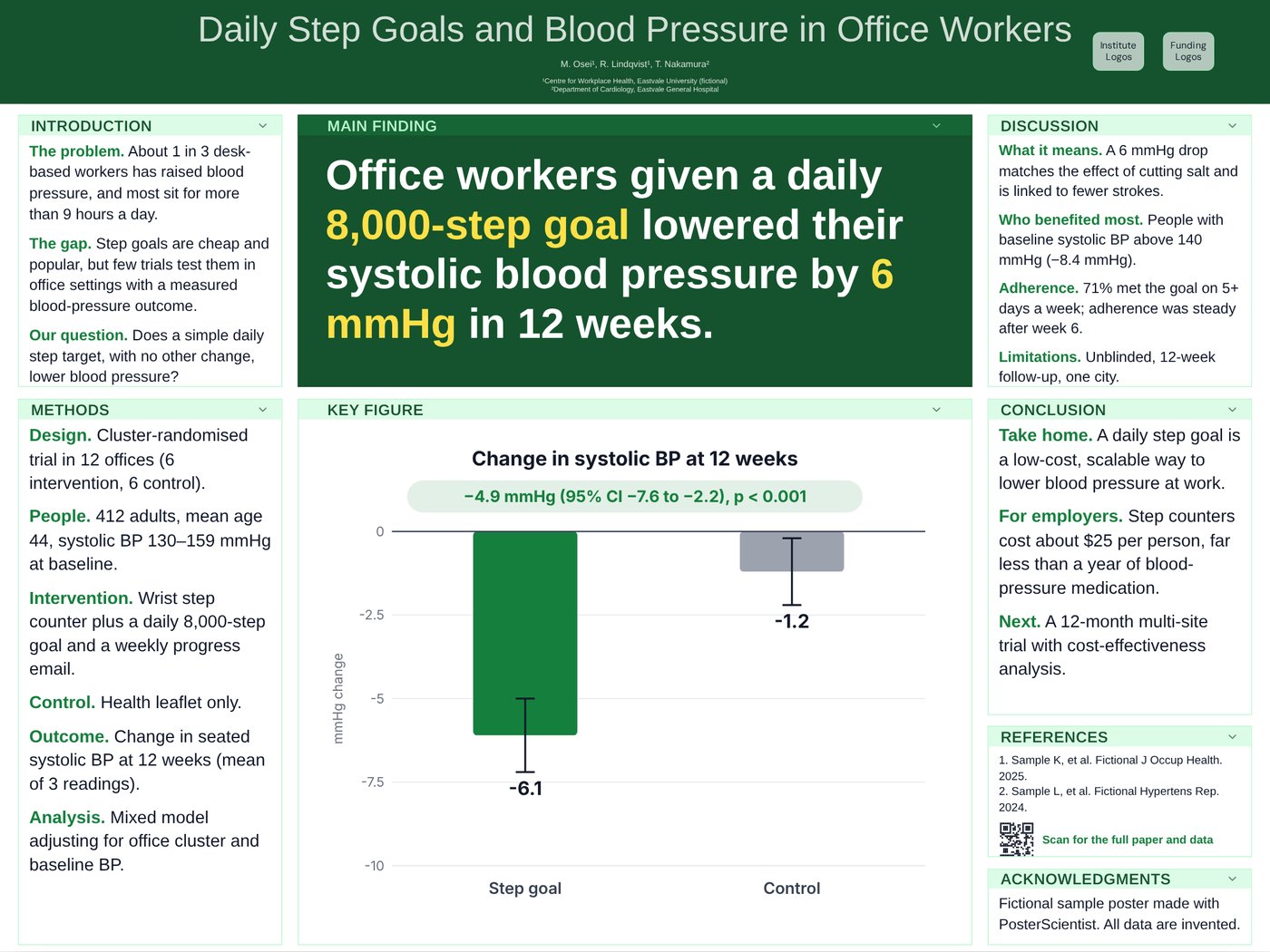
Daily step goals lower blood pressure
Public health (fictional sample). The main finding takes the centre in very large type; the key figure sits directly beneath it, and the side columns hold the background, methods and discussion for people who want details.
Templates with a central key finding
-
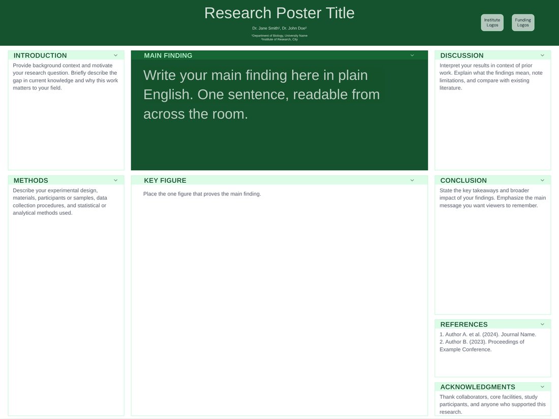
Billboard (Free)
Free. A wide centre column with a "Main Finding" box set at about 2.6× body size and a Key Figure below; narrow side columns for everything else.
Open Billboard -
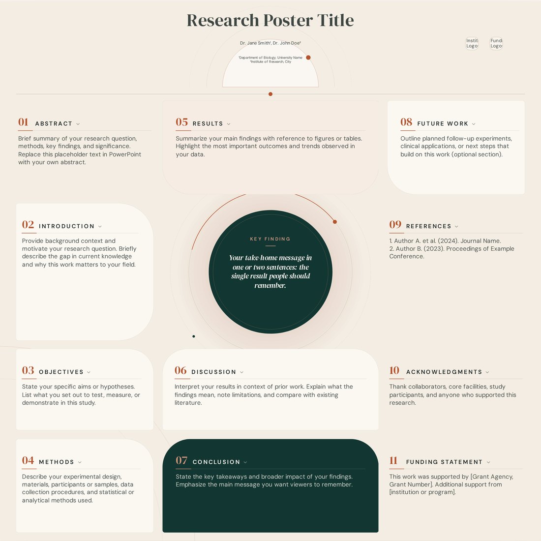
Atelier (Pro)
Pro. An editorial layout whose cards curve around a large circular key finding.
Open Atelier -
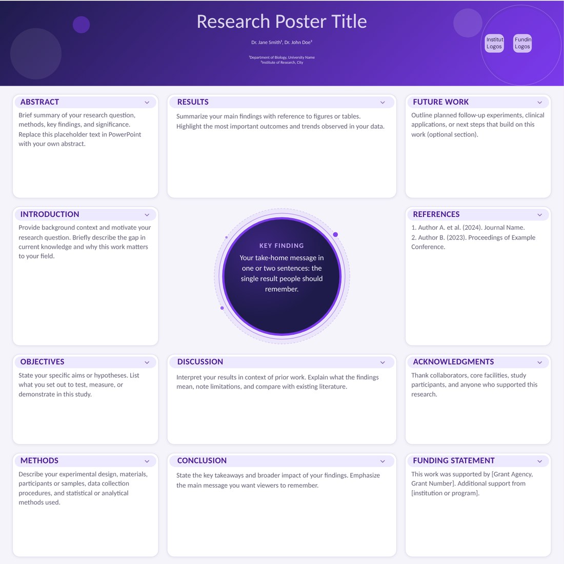
Orbit (Pro)
Pro. A circular key-finding hub ringed by rounded cards; good when one idea links everything else.
Open Orbit
How the better-poster layout works
- Main finding in the centre, written as a plain-English sentence, large enough to read from across the room.
- A QR code near the main finding linking to the paper, preprint or data.
- A side column (often called the "silent presenter") with the essential background, methods and results for people who stop to read.
- Another side column (the "ammo bar") with extra figures and detail you can point to when answering questions.
When it works, and when it does not
The format works best when you have one clear result and a busy poster hall, which is why it spread quickly at large conferences. It is less suited to posters whose value lies in many small results, to methods posters, or to meetings whose instructions require a fixed abstract-introduction-methods structure. Some researchers also find that a slogan-style finding oversimplifies nuanced work; in that case a central key-finding box inside a conventional layout, as in Atelier or Orbit, is a good compromise.
Writing the main finding
- Say what you found, not what you studied: "Daily step goals lowered blood pressure by 6 mmHg".
- Use everyday words; save the technical terms for the side columns.
- Keep it under about 20 words and check it reads from 5 m on a test print.
Frequently asked questions
Is the Billboard template free?
Yes. Billboard is free to edit and download as PowerPoint or SVG. Atelier and Orbit are part of Pro Lifetime.
Who invented the better poster?
The #betterposter layout was popularised by Mike Morrison in 2019. Our templates are independent designs inspired by the same idea; we are not affiliated with him.
Is a better poster the same as a billboard poster?
People use both names for the same idea: a poster built around one large, plain-language main finding.