Scientific Poster Templates for Data-Heavy STEM Research
In the sciences, the figures are the poster. Reviewers walk the hall looking for plots, micrographs, spectra and schematics, and only read the text when a figure catches their eye. These templates are built around that habit, with results areas sized for large graphics and methods panels that suit diagrams.
Below you will find figure rules that apply in every STEM field, then specific advice for biology, chemistry, physics and engineering.
Build a science poster · Science poster design ideas
Designs suited to figure-led science
-
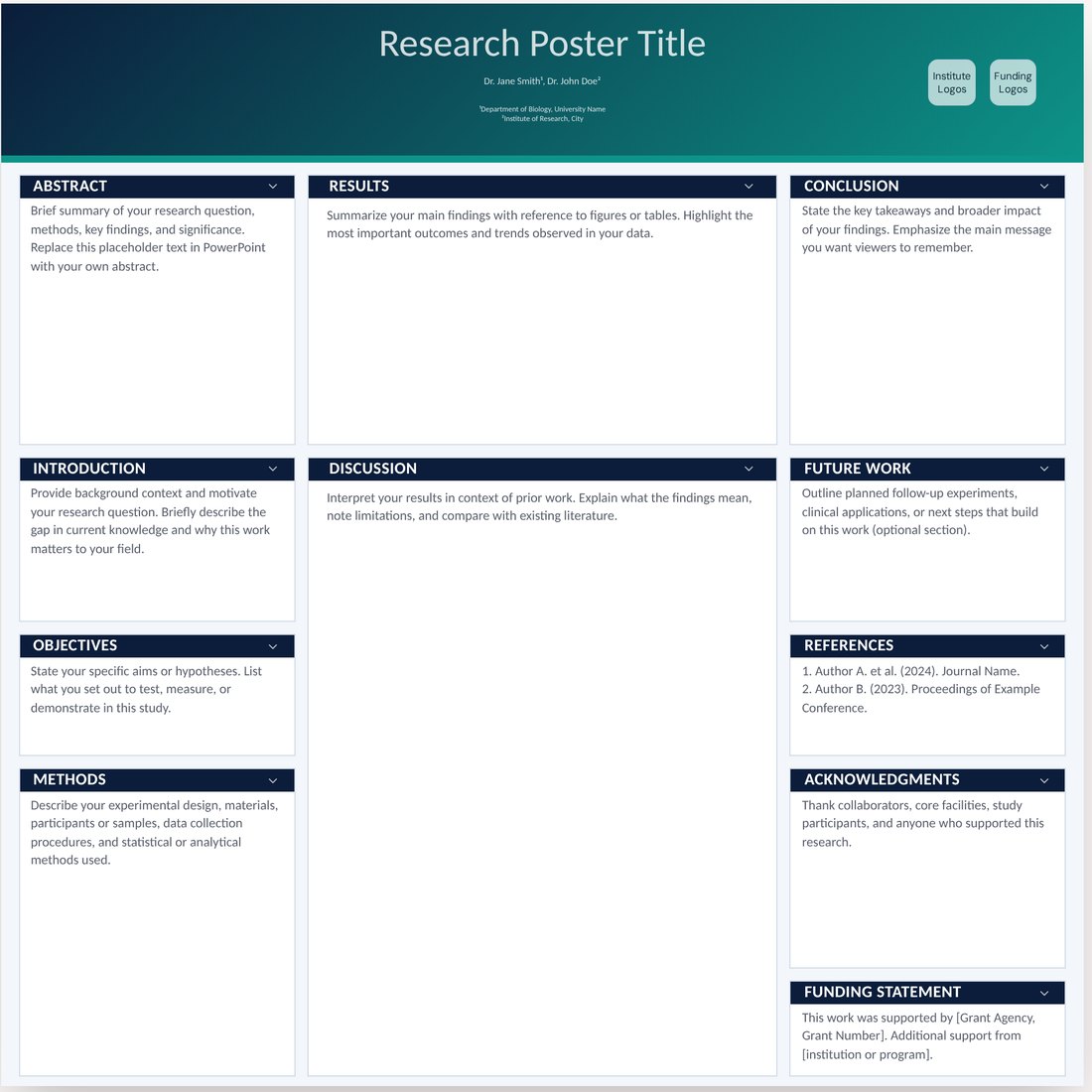
Midnight Aurora (Pro)
Its wide results column takes two large plots side by side, which suits imaging and omics.
Open Midnight Aurora -
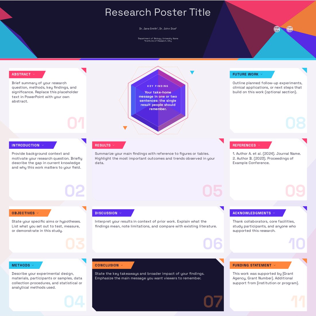
Prism (Pro)
High-contrast panels make reaction schemes and molecular structures stand out.
Open Prism -
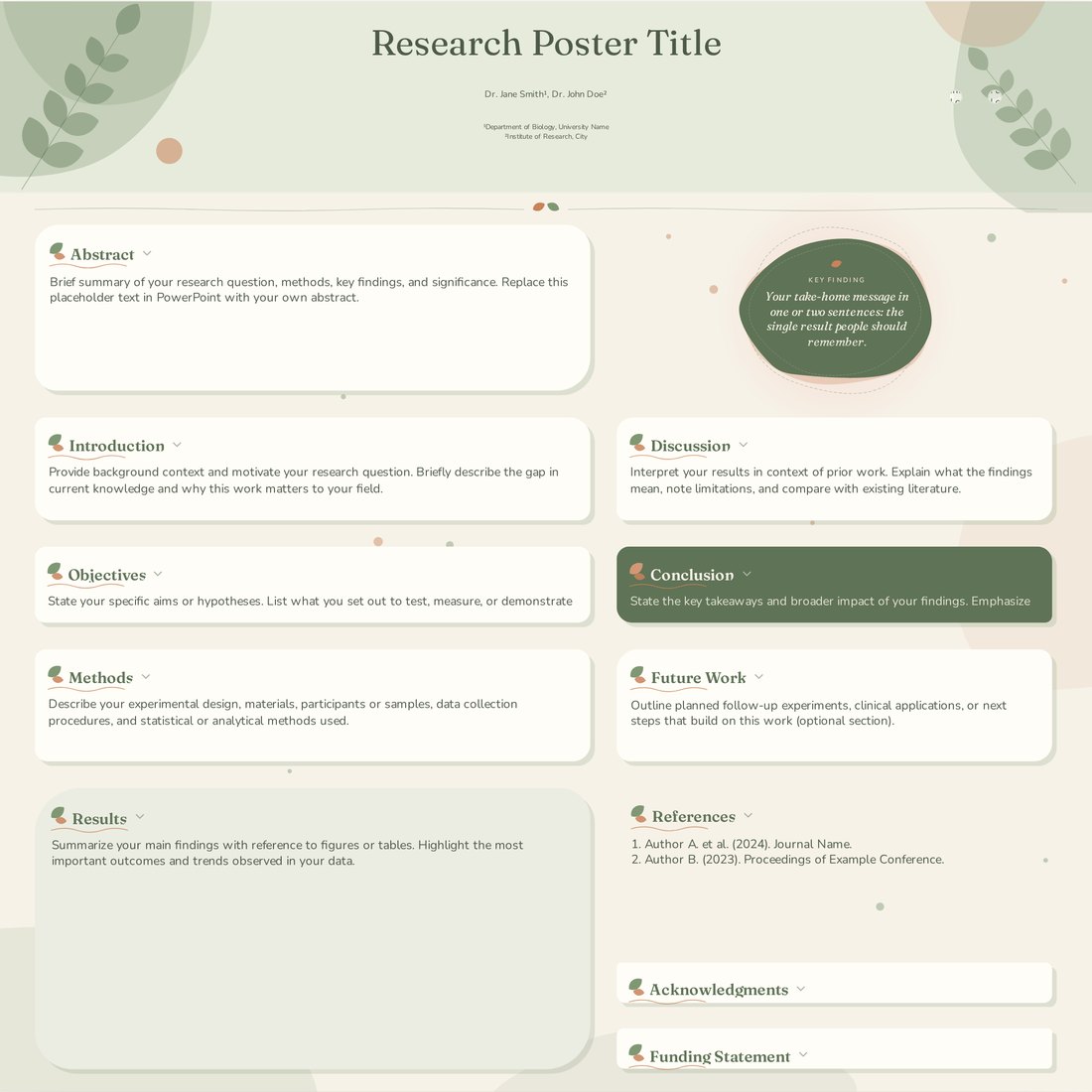
Botanica (Pro)
An earthy palette and an asymmetric two-column grid for field ecology and plant science.
Open Botanica
Figure rules for poster scale
- Make each key figure at least 25 to 30 cm wide on an A0 poster, so it reads from two metres.
- Axis labels and tick labels at 24 pt or more; lines at least 2 to 3 pt thick.
- Label data series directly at the end of each line instead of using a legend.
- Delete gridlines, borders and 3D effects. Keep the one comparison that matters and grey out the rest.
- Show individual data points where possible, with error bars defined in the caption (SD, SEM or 95% CI).
- Export plots as vectors (SVG or PDF), and photos or micrographs at 300 dpi at the printed size, with scale bars.
Turning methods into a diagram
A methods paragraph is rarely read on a poster. Replace it with a flowchart: samples or participants at the top, treatments or conditions in the middle, measurements and analysis at the bottom. Add sample sizes at each step. For clinical studies, a CONSORT-style flow diagram does this job and is familiar to every reviewer.
Results-heavy layouts
For figure-led science, give results 40 to 50 percent of the poster area. Place the strongest figure at eye level in the upper middle. Write each results heading as the conclusion of that figure ('Knockout mice gain 30% less weight') so a visitor can skim headings alone and understand the study.
Field-specific advice
- Biology and biomedicine: lead with a graphical summary of the mechanism, keep gene and protein names consistent with the figures, and state n for every panel.
- Chemistry and materials: draw schemes in a consistent style (for example ACS settings in ChemDraw) and scale them up together so bond widths match. Put characterisation data (NMR, XRD, SEM) in a compact strip.
- Physics and astronomy: use equations sparingly, number the few you keep, and pair each with a plot showing what it predicts.
- Engineering and computer science: show the system architecture as a block diagram, put benchmark results in a simple bar or line chart against baselines, and add a QR code to the code repository.
- Earth and environmental science: maps need a scale bar, north arrow and a colour-blind-safe colour ramp such as viridis.
Colour for scientific data
Use perceptually uniform colour maps (viridis, cividis) for continuous data and a qualitative palette such as Okabe-Ito for categories. Avoid rainbow colour maps and red-green contrasts, which mislead or exclude colour-blind readers. Keep the poster theme colours separate from the data colours so figures stay clear.
Frequently asked questions
How many figures should a scientific poster have?
Usually two to four main figures plus a methods diagram. More than six becomes hard to follow in the few minutes a visitor spends.
Can I put equations on a science poster?
Yes, but keep them few and large. Typeset them as images or vector graphics at a size that matches the body text.
What resolution do microscopy images need?
Aim for 300 dpi at the final printed size, keep the original aspect ratio, and always include a scale bar.