Research Poster Templates: Choosing a Layout and Filling Each Section
A research poster template is a pre-built structure: a title band, a grid of columns and a set of named sections. Picking the right one saves hours, and knowing what belongs in each section is what turns a template into a poster people read.
Use the first half of this page to choose a layout, and the second half as a section-by-section writing checklist.
Start from a template · See all designs
Three layouts for three kinds of study
-
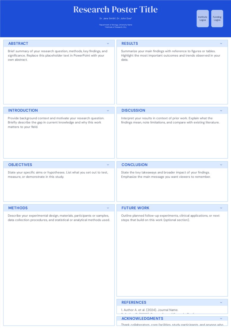
Classic Academic (Free)
Even columns. For studies with balanced text and figures, and for first-time presenters.
Open Classic Academic -
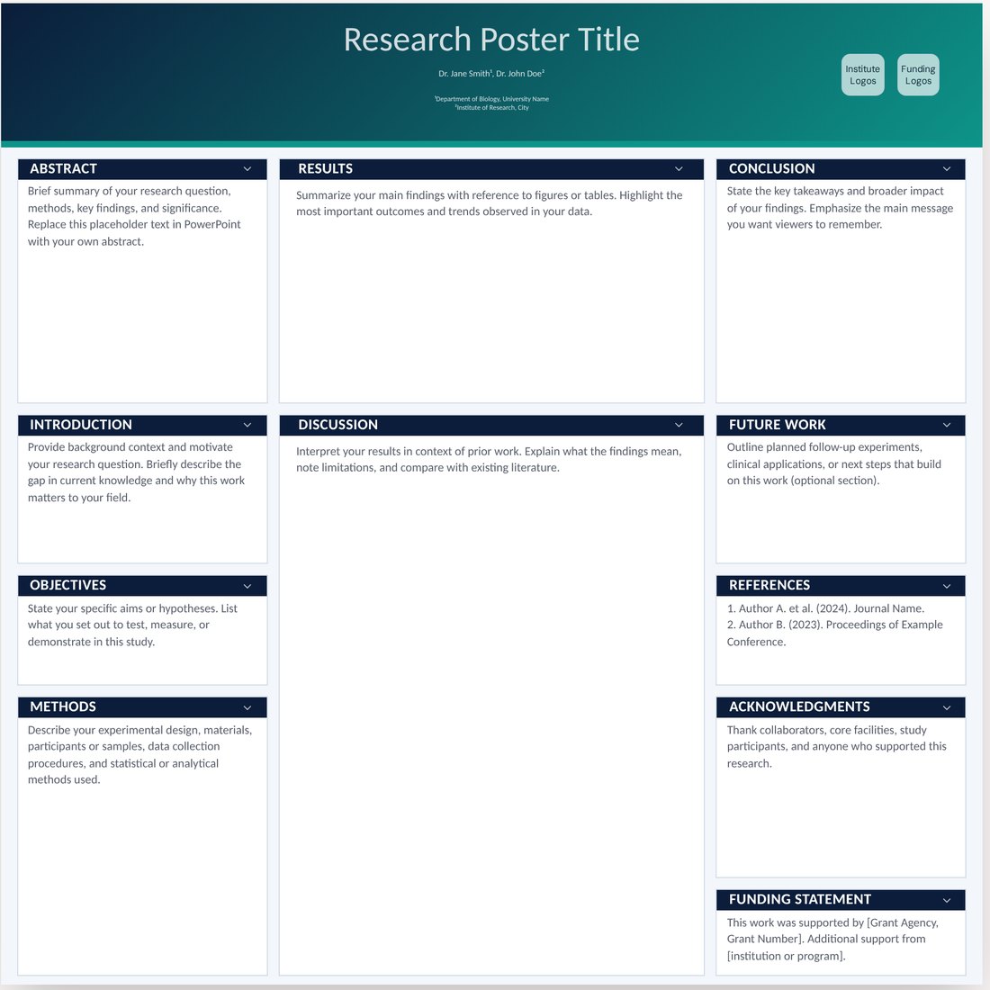
Midnight Aurora (Pro)
Wide centre column. For studies whose contribution is mostly data and figures.
Open Midnight Aurora -
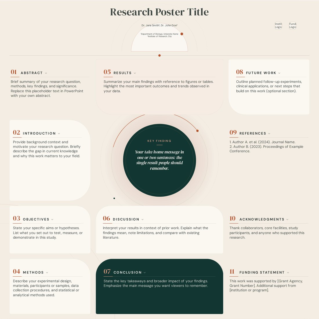
Atelier (Pro)
Central key finding. For studies with one headline result you want people to see from the aisle.
Open Atelier
Step 1: Match the layout to your study
- Even columns suit mixed content and work at every conference. Choose two columns for A1, three for A0 portrait and four for 48 x 36 landscape.
- A wide results column suits imaging, omics, clinical outcomes and anything with several large plots.
- A central key-finding layout suits a single striking effect, a new method with one benchmark, or a public-engagement poster.
- A flow layout suits pipelines, engineering systems and multi-stage protocols, where the order of steps is the story.
Step 2: Match the style to your discipline and venue
Clinical and biomedical meetings favour clean, light designs with restrained colour. Humanities and social science posters often carry more text, so a serif typeface and generous margins help. Engineering and computing audiences respond well to technical, grid-based styles, while ecology and environmental posters suit natural palettes. At very large meetings, a bolder design helps you get noticed; at a small workshop, calm and clear wins.
Section-by-section: what to write
- Title: state the finding in under 15 words. 'Exercise reverses insulin resistance in aged mice' beats 'Effects of exercise on metabolism'.
- Authors and affiliations: presenting author first or underlined, superscript numbers for institutions, and logos grouped in the header.
- Abstract or summary: optional on posters. If kept, cut it to three sentences: question, approach, answer.
- Introduction: two to four sentences. What is known, what is missing, and the question you asked.
- Objectives or hypotheses: one to three numbered aims, so visitors can match them to results.
- Methods: steps, a diagram or a short list of key parameters. Leave full protocols to the paper.
- Results: one heading per figure, written as the takeaway. Two to four figures is usually enough.
- Discussion and conclusions: three bullets on what the results mean, plus one line on limitations.
- Future work: one or two concrete next steps. Useful for prompting conversations with potential collaborators.
- References and acknowledgements: smallest text on the poster, five to ten references at most, funding numbers included.
Step 3: Trim until it fits without shrinking the type
When a section overflows, shorten the text rather than reducing the font. Body text below about 24 pt on an A0 poster is hard to read at a normal viewing distance. A full poster usually lands between 300 and 800 words.
Frequently asked questions
Can I add or remove sections from a template?
Yes. Rename any section, delete the ones you do not need, or add new blocks such as a QR code panel or a second results section.
Can I switch templates after I have started?
Yes, from the template menu at any time. Colours reset to the new template's default theme, so review the poster after switching.
Which template is best for a thesis or student poster?
Classic Academic with three columns. It is free, familiar to examiners, and easy to fill.