Poster Header Design Ideas: 16 Title Bands That Stay Readable
The header is what people read from the aisle. Sixteen header designs, from solid bands to light paper styles, with rules for contrast, title length, logos and institution colours.
By PosterScientist · Published · 6 min read

Quick answer
What makes a good research poster header?
A good poster header shows a short title (under about 15 words) in large type with strong contrast, the authors and affiliations on smaller lines below, and logos kept to the sides. Choose a calm band: a solid or subtly graded dark colour with light text, or a pale band with a dark title, and save your accent colour for a thin rule or bar.
People decide whether to stop at a poster from three to five metres away, and at that distance the header is all they can read. It has two jobs: make the main message legible, and say who did the work. Decoration is only useful when it helps with those two jobs. Here are sixteen header designs and the rules that keep each of them readable.
What a poster header has to do
- Carry a title readable from five metres. On an A0 or 48 × 36 in poster that means roughly 85 to 120 pt.
- Name the authors and their institutions on smaller, quieter lines.
- Hold logos without letting them compete with the title.
- Set the colour scheme for the rest of the poster, so section headings and highlights feel related.
Sixteen header designs
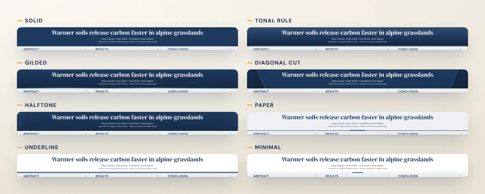
The Header section of the editor shows every design as a live preview in your poster's own colours, alignment and logo position, so you see the real result before choosing. Thirteen designs are dark bands with light text and three are light.
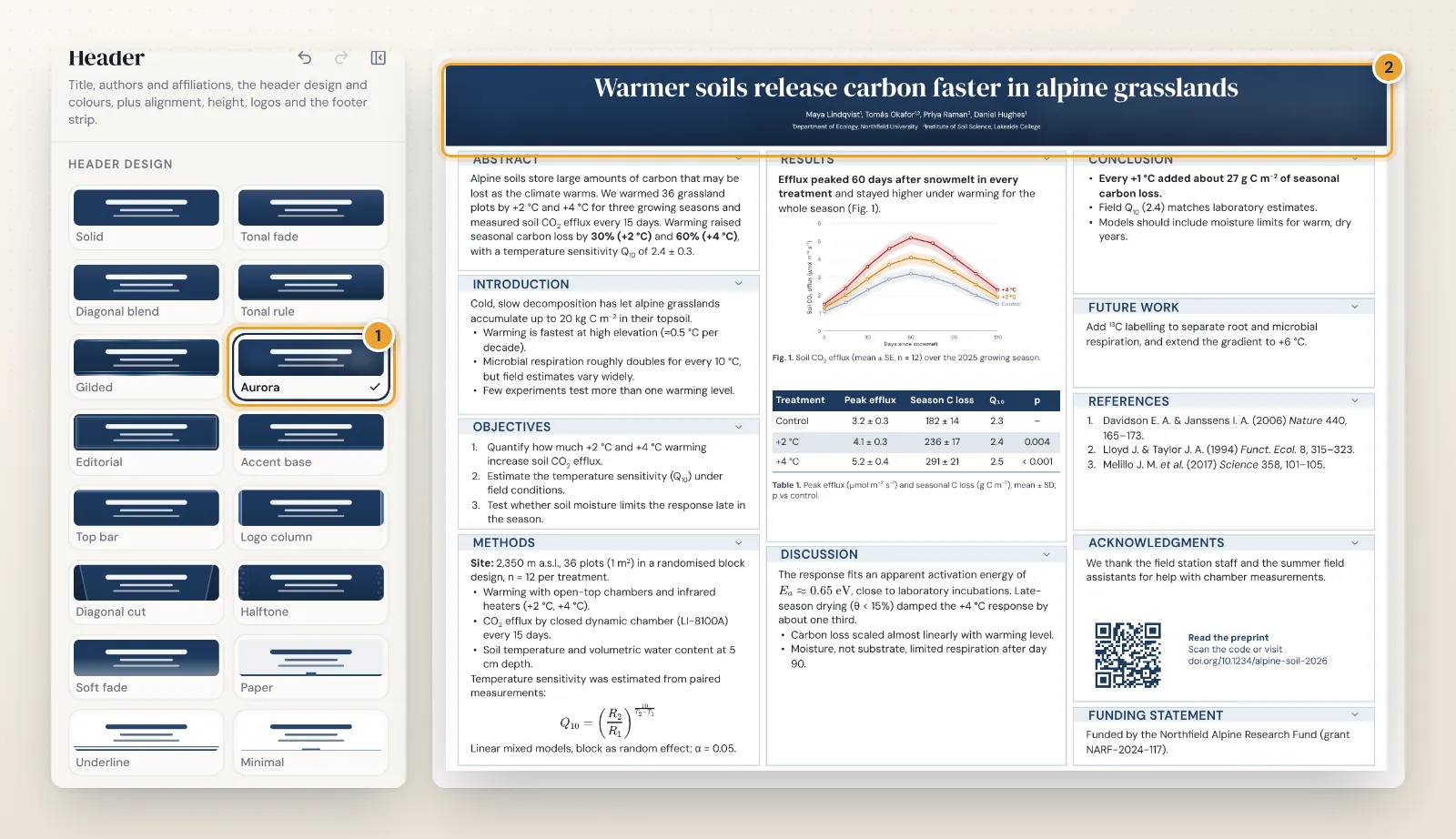
| Design | What it does | Try it for |
|---|---|---|
| Solid | Flat header colour | Any poster; the safest choice |
| Tonal fade | A luminous top easing into a deeper tone | A soft, modern look |
| Diagonal blend | The header colour turning into a related tone | Gentle movement without pattern |
| Tonal rule | Deep gradient with a fine accent rule under the text | Formal, editorial posters |
| Gilded | Fine metallic hairlines in the accent colour | Humanities and award sessions |
| Aurora | Soft glows of accent colour, kept subtle | Physics, astronomy, dark themes |
| Editorial | A double hairline frame inside the band | Classic, journal-like layouts |
| Accent base | Deep band on a slim accent base | Linking header and section colours |
| Top bar | A bold accent bar along the top edge | Standing out in large halls |
| Logo column | An accent column behind the logos | Posters with several logos |
| Diagonal cut | A deeper panel cut on a diagonal beside the title | Engineering and technical work |
| Halftone | A faint dot pattern easing in beside the title | Data-heavy posters |
| Soft fade | An airy fade towards the poster background | Light, open layouts |
| Paper | A pale wash of the header colour with a dark title | Clinical and medical posters |
| Underline | A light header with a bold coloured underline | Minimal, white posters |
| Minimal | Whitespace, a short accent bar and a fine line | Text-light, typographic posters |
Ideas by situation
- A huge international meeting: Solid, Top bar or Accent base in a deep colour. Strong, simple bands read best across a crowded hall.
- Clinical, medical and nursing posters: Paper or Underline keep the poster white and calm, as in the medical poster templates.
- Humanities and social sciences: Editorial, Tonal rule or Gilded give a printed, bookish feel that suits a serif layout such as Elegant Serif.
- Engineering and computing: Diagonal cut or Halftone suit technical grids like the engineering poster templates.
- Several institutions and funders: Logo column keeps a row of logos tidy beside the title.
For more complete looks, from dark mode to editorial layouts, see 12 science poster design ideas.
Keep the title readable
Every design follows one rule: nothing with real contrast (rules, bars, frames, dots) is drawn behind the header text. Decoration stays at the top and bottom edges, in the margins or beside the text column. If a design and your colours would make the title hard to read, the editor switches the title colour and tells you so in the Header colours group.
A few more habits make any header work:
- Write the finding as the title, in under 15 words, and break long titles onto two lines with Shift+Enter.
- Keep authors and affiliations smaller than the title and use superscript numbers to link them; the guide to symbols, subscripts and superscripts shows the quickest way.
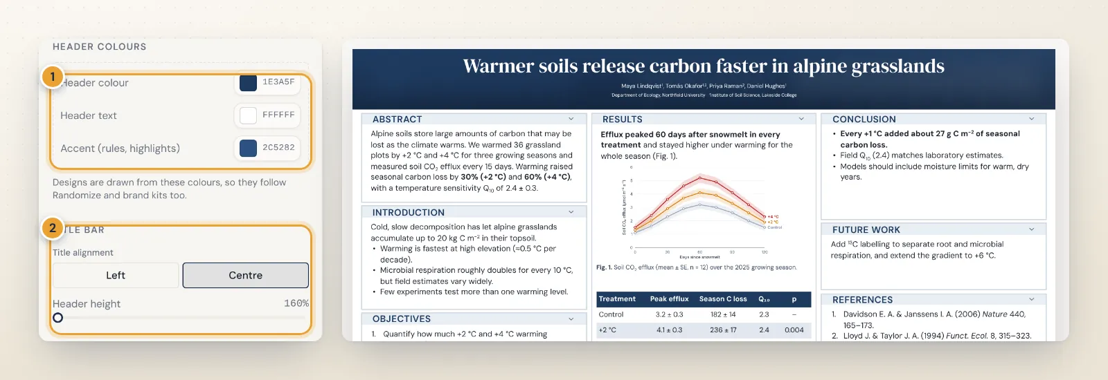
- Centre or left-align consistently. Title alignment offers Left and Centre; centre suits symmetric layouts, left suits posters with logos on one side.
- Avoid photos behind the title. They lower contrast and make the band look busy from a distance.
Logos and brand colours
The Logos group switches institute and funding logo slots on or off, sets their size and puts them on the left or right of the title. If you make posters for a lab or department, brand kits (a Pro feature) store your colours, fonts and logos and apply them to any template in one click. Without Pro, type your institution's HEX colours into Header colour, Header text and Accent; the header designs are drawn from those colours, so they follow automatically.
Common header mistakes
- A title in capitals. All-caps text is slower to read and takes more space; use sentence case and let size do the work.
- Too many logos. Six logos in a row shrink each to a smudge and crowd the title. Keep the lead institution and main funder in the header and move the rest to the acknowledgements.
- Full postal addresses. Department, institution and city are enough; e-mail and ORCID belong in the contact line.
- Tiny author lines. Authors should still be readable from two metres, roughly 48 to 60 pt on an A0 poster.
- A gradient that runs from dark to light behind the text. Part of the title ends up with poor contrast. Keep strong tonal changes away from the text, or pick a design that does this for you.
- A header taller than it needs to be. Every extra centimetre comes out of the results. Size it to the title, not the other way round.
Do not forget the footer strip
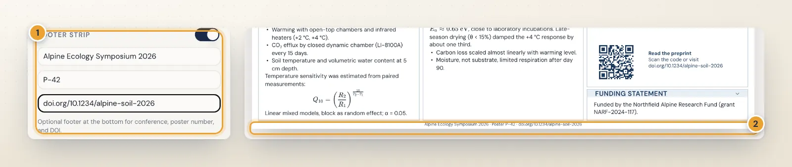
The optional footer strip runs along the bottom of the poster with the conference name, your poster number and a DOI or link. It is small, but it helps people find you in the programme and cite your work later.
Try the designs on your own poster
Open the free research poster maker, choose any of the 23 free templates, and switch header designs until the title reads well from across the room. The typography guide helps with font choice, and the poster layout guide with the structure below the header.
Frequently asked questions
How tall should a poster header be?
Tall enough for a one- or two-line title plus the author and affiliation lines, which on most posters is roughly 10 to 15 percent of the height. In PosterScientist the Header height slider in the Header section adjusts it, and the boxes below reflow.
Should a poster header be dark or light?
Both work. A dark band with light text stands out from the aisle and suits busy poster halls. A pale band with a dark title looks calm and clinical, uses less ink and suits medical and humanities posters. Either way, the title needs strong contrast with the band.
Where should logos go on a poster header?
To the left or right of the title, small and aligned, so they never compete with it. In the editor the Logos controls switch institute and funding logo slots on or off and set their size and side, and the Logo column design puts an accent panel behind them.
Can I use my university's colours in the header?
Yes. Type the HEX values into Header colour, Header text and Accent in the Header section. Brand kits, a Pro feature, save your institution's colours, fonts and logos and apply them to any template in one click.
Do header designs survive the PowerPoint export?
Yes. Each design is drawn from shapes in the poster's own colours, and the preview, the SVG export and the PowerPoint export match. Every shape stays inside the header band, so nothing spills over in PowerPoint.